Ekscuse my bad english.
I think the oldstyle odd look of the Biab ads in music magazines are very harmfull - and have been very harmful through the years for the widespread and sales of Biab.
The add look like something that I could have produced with Pagemaker on my first Mac SE in 1990.
The add is breaking all Typhograpich rules in one go. Quite a feast.
Its downright ugly. People just dont read adds that arent attractive in any way.
I could go on and on rambling about the trouble with the adds. They are catastrophic.
I love Biab.
But please Mr. Gannon - the the add you produced yourself on the office Mac in 1991, just dont cut it anymore. Yes your mother was proud of you - and the girls in the office were impressed that you learned to master Pagemaker.
But mabee its time to move on an hire professionel people to make a new add.
And maybee its not a good idear to use the same add for 10-15 years.
Hanki
While I cannot comment about the advertising, I can say "Welcome to the forums"
Trevor
Trevor
Been around for about 10 years - old login stopped working.
Well, welcome back then, Hanki!
Many people here have commented on the dated appearance of the PG Music logo and the BIAB user interface. I haven't read any music magazines in years, so I wasn't aware that print ads were still running. If it is as you say, then yes, they should be brought up to date. I have also long advocated for documentation of OF Music products being turned over to specialists for the sake of completeness and proper indexing. Perhaps someone is listening.
Richard
Some people have too much time on their hands.
Hanki,
Thank you for your input. It would help if you (or anyone) could provide a link to an ad somewhere on the Intenet that you do like.
"Some people have too much time on their hands."
Well said,
Don S.
I think it could be a matter of "You can't please all the people all the time".
Advertising is an art as much as a science. What pulls in new customers? Does a particular ad appeal to some, and turn away others? Is modern always better? Is something out of the ordinary more noticeable? Is a more traditional ad suggest stability?
I think anything that some people like, others will dislike.
Like the GUI of BiaB. Some people hate it, for me it's very functional. I think it is neither beautiful nor ugly, but I like that the buttons to the features I need are on the screen when I need them. That's what's important to me.
As far as the ads are concerned. You could think of them as dated, or you can think of them as traditional. If you are already a BiaB customer, it must have worked for you.
Peter, I'd love to give you advice on how to write the best new customer pulling add in the universe, but if I knew that, I'd also become a consultant, because Microsoft, Apple, General Motors, Warner Brothers, EMI, and millions of other companies would pay huge bucks for that kind of information.

Thanks for the software, for me, that's what counts!
Insights and incites by Notes
I love Biab.
But please Mr. Gannon - the the add you produced yourself on the office Mac in 1991, just dont cut it anymore. Yes your mother was proud of you - and the girls in the office were impressed that you learned to master Pagemaker.
But mabee its time to move on an hire professionel people to make a new add.
And maybee its not a good idear to use the same add for 10-15 years.
1st if all welcome back Hanki (but) IMHO . . . Wow you could have gotten the same message across without the last two pretty sarcastic digs at Mr. Gannon, or is it just me seeing it this way?
Later,
Agreed. Got no couth at all. Do people still actually read 'music magazines'?
I need to get out more!

Could we at least give credit to the OP for wanting to help? Perhaps it could have been phrased better, but it is clear that he is concerned about the success of PG Music products. Many of us have suggested other things that could use improvement. I don't remember anyone being criticized as this individual has. How about some positive comments here? Otherwise we are guilty of the same thing with the OP is charged.
Richard
. 'Could have been phrased better'?
Ya think?
Regards,
Bob
I like the retro feel to the advertising. Tends to attact a specific demographic and at the same time keep out the riff raff.
And regarding the OPs comments. I can cut him a little slack since English is not his native language. He may have been simply trying to inject a little humor. I once tried to tell a joke in Japanese and almost got a drink thrown in my face.

There is one very important thing that has been missed and that is Peter's reply:
"Hanki,
Thank you for your input. It would help if you (or anyone) could provide a link to an ad somewhere on the Intenet that you do like.
_________________________
Have Fun!
Peter Gannon
PG Music Inc. "
Thus far no responses to this!
If you want the adds to change then give Peter some suggestions.
I would like to share some adds but I am about 1200 miles from my computers. I am using a very old and slow ASUS notebook running Ubuntu Linux that won't let me onto a lot of sites and times out quite frequently. It is the computer's fault, not necessarily the OS.
I kind of like the adds that features a young blond girl draped over an amp with a guitar between her .... oh, nevermind, that might not work for us here.

Dan: You disagree with me. That's fine, but is it necessary to attack me too? I'm just trying to keep this discussion in line with something I heard about our forum being a friendly place.
I agree that the OP would be well advised to provide an example as the Good Doctor requested.
R.
.......You disagree with me. That's fine, but is it necessary to attack me too?
Can you correct that, I got a reputation to protect around these parts... or did I miss something here?
Sorry.

C'mon guys give Hanki a break, the first thing he said was
"Ekscuse my bad english."
Bob
I read several 'music magazines' and I don't recall seeing a PG Music ad in several years. I do occasionally see the ad for Norton Music ad-on styles. This ad is unchanged for maybe 20 years, but as small as it is, it works. It got me to call.
Perhaps this is what the OP saw?
Maybe he saw it in an old magazine at the doctors' ....?
I read several 'music magazines' and I don't recall seeing a PG Music ad in several years.
I'm looking at the May 2015 issue of Electronic Musician - page 15 - BIAB
I tried to see if one could peruse the issue online without a subscription and it's not possible.
just saw the ad in Electronic Musician...and I see what the OP means...the ad has a very dated look, especially compared to the more modern ads in the mag. but I guess I fail to see point of this thread.
if that ad is working for PG (or if they think it is) and they honestly do not see the difference between their ad and the ads around it (Focal, Novation, Spectrasonics, Glyph, Academy of Art University and Williams) I doubt any amount of forum conversation would change that!
I just hope they continue to do well enough to keep delivering updates to this amazing software!!
BTW, Electronic Musician is only $1.99/issue on my tablet so I subscribed tonight! Thanks Scott!
I'm looking at the May 2015 issue of Electronic Musician - page 15 - BIAB
I tried to see if one could peruse the issue online without a subscription and it's not possible.
Any chance to scan the ad so that we could see it?
Thanks
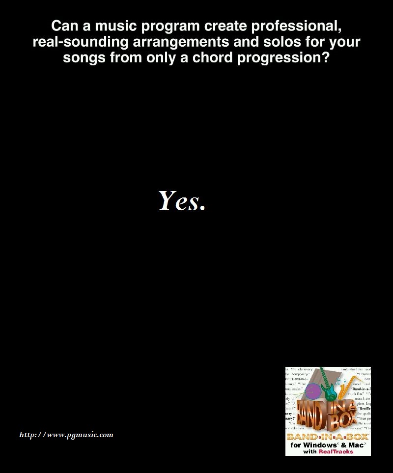
The ad is surprisingly bad. There’s way too much info. It doesn’t make you want to read it. It does the opposite.
It’s almost like looking at a page from a tech file. Let’s face it, no one wants to read a page from a tech manual unless you absolutely have to in order to find some info on how fix something.
The purpose of a one page ad is to get someone to check out your web site. Not try to tell them everything about your product.
PG should hire a professional music advertising company to redo the ads and the web site.
It is so bad that is almost good
All the praise crowds out the most important info, namely, real instruments low price at entry, and 30 day fund return policy, as well as Realband being a DAW and included free of charge. Maybe just a colour change to highlight the important info and a subtle light blue or green for the unformatted comments. I wouldn't try to copy what is defined as good by the other guys otherwise you go under in the sameness.
I wouldn't change the image too much either, maybe just replace the instruments with musicians playing them to emphasise the real tracks.
All in all it aint that bad considering that retro is in at the moment. In the ever changing sofware world it's maybe a plus to be old fashioned. Let's face it, most advertising is crap these days so if you stand out by being good it's ok, and if you stand out by being bad, then that's also ok.
Just consider that Gibson haven't changed the ES335 or the Les Paul much and Martin still plugs the DH28 as the basis of their designs, so modern aint everything.
First of all I think OP's post was with good intention.
Second of all, I see Peter Gannon's post as polite, caring and appropriate.
Third of all I really think it comes down to a matter of taste.
Advertising is an art as well as a science, and even the best can't really tell you if an ad will pull or not. That's because different things appeal to different people.
If any one of us knows what will pull the best for any particular audience, he/she should go into the consulting business and make enough money to retire in a month or so.
Insights and incites by Notes
I reworked it slightly:

Kudos to GHinCH for the nice clean ad.
Obviously, the original ad is to show that users love BIAB. I don't think there is much wrong with it -- but once you see other approaches, then maybe you say "it could be better".
Advertising is an art as well as a science, and even the best can't really tell you if an ad will pull or not. That's because different things appeal to different people.
"(Parenthesis) See Stan Freberg, Comedic Genius, Advertising Executive, Sadly Deceased (Close Parenthesis)".
(Only true fans will get the reference)

))) Obviously, the original ad is to show that users love BIAB.
Correct. It is intended as a simple ad, with a small message. The message is in the center, and it is the small paragraph that tells you what BiaB is. The other message is that customers love it, and it sounds like musicians.
People here who have commented that they thought they were supposed to read the entire background are a surprise to us. But it would be worth us redoing the colors and contrast of the various areas to clarify things.
))) All the praise crowds out the most important info, namely, real instruments low price at entry, and 30 day fund return policy, as well as Realband being a DAW and included free of charge. Maybe just a colour change to highlight the important info and a subtle light blue or green for the unformatted comments.
Good point. Thanks Chris. At previous times, we had a fainter background color, and that worked better. So we can change that.
The purpose of the background quotes are not to be read, but just to be background wallpaper. Lots of ads do that, including modern ones that have used top ad agencies.
http://s133.photobucket.com/user/anya678/media/task-11-10/illustrations/12-typography-based-print-ads-10.jpg.htmlhttp://www.entheosweb.com/images/typography/ideas/tips_clip_image007.jpg
Peter, since you are listening here I thought I'd toss out a few suggestions...
- use a word cloud instead of this very old technique of Pagemaker wrapping
- never break lines of text across a large graphic in the middle of a page; wrap the text into columns instead
- use a LOT more white space (I know we always love to fill our ads but usually less if better)
- as you acknowledged, if you are using a ton of text as "wallpaper" then fade it way back
- seriously consider upgrading your logo; I know you probably hate to hear it but it looks so very dated with the 3d text and clipart instruments
Overall the ad suffers from a very basic lack of "design" and it can be a challenge to nail down exactly what that means!
But if you look at the ads around yours (Focal, Novation, Spectrasonics, Glyph, Academy of Art University and Williams) in just this one issue of Electronic Musician you will notice how much good solid "design" can improve an ad.
I can honestly say the software you have created is the most amazing program I have ever seen! That is not hype/fanboy talk...it is true! But I can also honestly tell you I was very reluctant to initially purchase it because of the impression I got from your marketing materials. The folks here on the forum finally convinced me to go ahead and buy it and now you have a customer for life! But I cannot help but wonder how many potential customers you are missing out on because they see your marketing and never bother to further qualify your products.
I know lots of people, especially hard-core fans, are quick to jump in and make excuses like "it is retro" and "if it ain't broke..." but if I was you I would have to seriously consider whether BIAB is successful
because of your image or
in spite of it!
Thanks for posting the link to the current ad. I don't read Electronic Musician. Their content has little value to me, as opposed to, say, Sound on Sound, and Recording.
And I did read every quote in that ad when I first saw it, if for no other reason than it includes a glowing comment from me: "Wow, this changes everything!". It's fun, sort of like a picture puzzle!
Make it simple and to the point.
People will investigate if you pique their interest.
Thanks for the helpful info and tips! Much appreciated.
Floyd, that ad looks great! Thanks
For logo redesign, yes I'm all for that, but don't have any leads on good logo designers. Of course we can begin to look for that but if anyone happens to have some leads for us, please let me know.
This is a little off-topic, but does fit in the "marketing" aspect to this thread.
One idea I was thinking of to help promote BiaB would be "video testimonials" that we could put on the main web page (and youtube of course). These could be from customers, who tell their own story of what they are doing in music generally, and how Band-in-a-Box and whatever other programs are helping them with that. It could also help the customer in getting promo for their own projects. Just an idea at this stage, and any feedback is appreciated.
"Some people have too much time on their hands."
Well said,
Don S.
+1
A wise manager I once had and greatly respected told me that criticism without offering corrective suggestion is not helpful, but destructive.
He also said: "If you can't measure it, you can't manage it!"
Welcome to the PG Music family.
Peter I would be happy to do a video testimonial how BIAB changed my musical life.
I'm good with audio but very inexperienced with video. If you decide to do this, some requirements/specs/suggestions would be welcomed.
Peter, about the logo. This is not original to me, of course. Many have suggested that you revert to the much cooler-looking "BIAB guy" as opposed to the decidedly dated present logo. If someone could do that as a mockup everybody would see what we mean. (It's beyond my graphics capability.)
Respectfully,
Richard
Richard -
Did you mean the "guy" on the cover of PowerTracks?

Video testimonials?
I don't think a video testimonial will help unless it is made by a "Tommy Emmanuel".
For my example I have selected one of the best of several not too good videos I've found. But this example shows in a simple way how to use BIAB.
Make a good video with several scenes:
1. Somebody plays a tune without a backing track.
2. That somebody shows how he or she made the backing track.
3. Somebody uses this exact backing track.
Properties:
A. The "Somebody" must have a temperament that is not addicted to Valium.
B. The making of a backing track must include several, but not too many, variants.
The reason I put in a QR code: Way too many people have a smart phone with the ability to do the "typing".
Peter, A couple of years ago I pointed you to the graphic design school of a Uni or college in Vancouver. The students there will work for a fee to update your overall logo and graphic design, to include the work in their portfolio. You might find one that is both a musician and graphic designer and pay them with product.
>>> Peter I would be happy to do a video testimonial how BIAB changed my musical life.
I'm good with audio but very inexperienced with video. If you decide to do this, some requirements/specs/suggestions would be welcomed.
Thanks Matt, that would be much appreciated. Yes, we would provide you with some specs before you start.
Here's one from Presonus, where they have Studio One Champions, which are testimonials (mainly written, but some video)
http://www.presonus.com/products/studio-one/connect/testimonialsHere's a video....
http://www.presonus.com/videos/player#Teddy-Riley-and-PreSonus-Studio-OneYou could model your video after this one, of course we would might add the flashy intro, but the basic video is just a one-sided interview where the guy is explaining who he is, and how he uses Studio One.
FWIW-I think that Peter's original post covers everything but is too cluttered. I like the other two but they are too sparse. My thought is to use a sparse one but have drop down menus, something like what can Band-in-a-Box do, what are RealTracks & Super MIDI Tracks, customer comments, videos (linked to PGMusic video index), etc. This would have a sparse intro but with links to everything in Peter's add.
Just my thoughts.
John Ford, yes, that is the one I had in mind. I thought that it had been used for BIAB for a time, though. If it's exclusive to that product, "never mind."
Very few companies use any kind of "mascot" or "emblem" these days.
Logos are generally all about the product name in some kind of cool font. There may be a "generic graphic" behind... but there is seldom an emblem. The Pro Tools "look" comes to mind... or Presonus Studio One...
Word Clouds are sort of cool. I did a word cloud of all the posts in this thread (the text on the buttons on every post sort of dominate!):

I took a direct marketing mail order course back in the 1990s when I started selling BiaB styles.
I remember that there were a few approaches to advertising, among them
- Looking 'hip' like everyone else
- The contrarian approach, looking different from everyone else
- The retro approach
- Luxurious look
- Beautiful models
- Celebrity endorsements
and a few others that I'll probably think of as soon as I click "Submit".
They couldn't tell what would work best for your product, but they offered a lot of food for thought about the subject. What is your audience? What is going to get their attention? Will looking like everybody else get their attention or get it ignored? Is it a predominantly male or female audience? This can go on and on and on and there were never any answers, because there is no definitive answer.
The thing it illustrated was to think about your intended audience. What kind of people are they? What will appeal to them?
The ad with a cowboy riding a bull appeals to a much different audience than a guy in a tux getting out of a luxury car in front of a mansion. Two young women grinning and sipping drinks with umbrellas in them appeals to a different audience than two young women in gym clothes sweating while they are exercising.
I'm not about to tell Peter what will work for his company, but if I knew for sure, I'd definitely share it.
In the old mail-order days, it was simpler to see what worked. Add some different codes to different ads or in different magazines (slight variation of the addressee, or Department #___, etc.) so you can measure which ad pulls better.
I did that with the same ad in different magazines and found which magazines my little classified ad worked better with than others.
Now you have to do other things to test the ad. Different URLs? Different codes for the same special offer? And so on.
I think this thread shows our loyalty to the BiaB community and our willingness to help it grow. That says a lot about PG Music and our BiaB 'family'. And I like what it says.
Insights and incites by Notes
I guess I am the only guy here how does not take or have the time to read magazines, too busy arranging music with BIAB for upcoming gigs. Although I include "lol" I am very serious. LOL
Later,
Just a bigger box, lmao!
Later,
Some of us flatulent old-timers remember when PGM's catalogue had absolutely no blank (white) space and read like a Joe Sugerman (JS&A) ad. Tiny print, too many superlatives, etc. (nobody had more superlative adjectives than Hurter's Sporting Goods Catalogue). A very eye-tiring read.
There may have been a time when such "super-hype" was necessary but we have a very successful, proven product in BIAB. We should merely need to nudge it along the path, not whack down the bushes that tend to obscure a proven trail.
A commercial artist friend told me it's what you DON'T show/say that captures the most attention. Great advice.
Addendumb:
Bob Carver (Phase Linear Corporation) loved techno-speak. Such gems as "Sonic Holography" and "Ambience Synthesis" etc.
Greg Mackie's Copy Writer was Ron Koliha, father of "Balls to the wall!" and similar catch phrases used in Greg's literature.
Very few companies use any kind of "mascot" or "emblem" these days.
Logos are generally all about the product name in some kind of cool font. There may be a "generic graphic" behind... but there is seldom an emblem. The Pro Tools "look" comes to mind... or Presonus Studio One...
Agreed, Floyd.
I spent a lot of Loonies trying to perfect a logo until Greg Mackie saw my efforts and blew me out of the water with: "Use a nice, unforgettable font, Don!"
I was importing electronic component parts (for Mackie and every major Consumer Electronics OEM in the US) at the time and Asian/Asean (Pacific Rim) businessmen put a lot of importance on your business cards, your storefront. I was working out of a spare bedroom and projected a HUGE Corporate image, totally without deception.
If imitation/copying is the sincerest form of flattery, I should be elated. I soon began seeing knock-offs of my card.
Advertising is 1% product and 99% hype, as I see it.
Peter, does PGM have Corporate colors (colours)?
I'm working on a specimen ad (bilingual. American English and Canuck English) and never the twain shall meet!
This is a forum of VERY creative people...
How about we try some logos?
This is a forum of VERY creative people...
How about we try some logos?
What....a
Mono waveform?
This is a forum of VERY creative people...
How about we try some logos?
That's pretty cool Floyd! I considered suggesting a PG-sponsored contest...Design Our Logo! But they would really be better served hiring a professional designer for something so important!
I have one in the hopper but would prefer doing it in Corporate colors, if we have any.
A concept graphic. Easy to edit.

Thanks, Richard. Tiz said: "Sell the sizzle, not the steak!"
I just realized that the wing covers the "in". Take 2 is on the drawing board.
I'd really like to know the Corporate colours and suggested wording before I edit the pic. Maybe links to tutorials?
Draft #2
Moved text to front.

This is a forum of VERY creative people...
How about we try some logos?
What....a
Mono waveform?
It's a vocal... all you need with the Band (in.a.box)
The talent, diversifity, generosity, and friendliness of the people in this forum always warms my heart.
This is truly the best forum I frequent. It's almost like being among family here.
Notes
The talent, diversifity, generosity, and friendliness of the people in this forum always warms my heart.
This is truly the best forum I frequent. It's almost like being among family here.
Notes
+1 Bob
For me the most important thing about Band in a Box, is that I can get to play with recordings of live musicians "Real Tracks" and change the chords/key/ tempo at will.
I notice this doesn't get a mention in the adds
I think many people think its MIDI Musak sort of thing - they are wrong of course, but I think assumption this stops sales.
I don't go for the "lots of user accolades" approach, I tend to not believe it, I think others are also sceptical.
"Change your Practice room, change your playing"
Z
The talent, diversifity, generosity, and friendliness of the people in this forum always warms my heart.
This is truly the best forum I frequent. It's almost like being among family here.
Notes
+1
Z
Zero,
I have one in the hopper that expounds on your points. I'm probably 2 hours away from posting it.
I just came to get real phone numbers and PG's address.
I hope to inform prospective customers of the many professional studio session players waiting for a conductor - the customer.
Graphic 03
This pic has the correct PG address, phone number and web addresses.
Comments are welcome and appreciated.

When I first saw BIAB in 1995, the only thing that caught my eye was auto accompaniment. I look at any ad for the content, not the graphics. Later, Ray
My favorite program is RealBand.
I would like to see a slogan that included the word Real and BIAB.
Get REAL Get BAIB
or Get REAL with BIAB.
Lots of regal plum colour and black in the graphics. Maybe yellow lettering. Cheers.
Graphic 04
A bit more color contrast, easy to read.

One of the members has a signature that went something like: "The best band is a Real Band".
They haven't posted for a while, but that line always caught my attention.
Wasn't that John, aka Silvertones?
Don, with each iteration you're zeroing in on something great. Two comments. I'd omit "Nashville" out of concern that folks would infer that it was somehow centered on country music. Leaving it out still leaves a true statement. The second is a positive. PGM hyphenates BIAB, which is both grammatically incorrect and cluttered looking. I prefer it your way.
hire/contract a designer who does logos and ads professionally...there is no acceptable shortcut to this critical part of your business!
Don, with each iteration you're zeroing in on something great. Two comments. I'd omit "Nashville" out of concern that folks would infer that it was somehow centered on country music. Leaving it out still leaves a true statement. The second is a positive. PGM hyphenates BIAB, which is both grammatically incorrect and cluttered looking. I prefer it your way.
Richard,
Your edit applied. Thank you for your input.
Don

Looks good by me, Don. I have nothing to add.
Wow you could have gotten the same message across without the last two pretty sarcastic digs at Mr. Gannon, or is it just me seeing it this way?
Later,
No, Danny, it isn't just you. I see it the same way as you.
Jeaux
Funny but true story. I commissioned myal2 company to do a logo for a new business called Recovery Pathways (mental health). When I got the designs back the said 'recovery partways'. We fell about laughing, but it was hard getting a refund
.
Like your stuff Don, do we need the address? Perhaps a picture of a session musician. Who was that drummer in the muppets? I am sure with your sense of humour you could find Something?
We probably don't need the complete steet zip place address. I also would include a QR code for easy smartphone access without typing. Email, website, phone are sufficient in a not too prominent way. It just needs to be there for smartphoneless people.
1.: Band-in-a-Box versus 2.: Band in a Box
I like the first one, because it is a unit. The second one is harder to trademark since it is only a phrase that could be used in normal language. The first one is clear in that sense. But the logo of Band-in-a-Box is without hyphenation:
http://www.pgmusic.com/gfx/bb_logo_homepage.png
Please remember that these are still "conceptual graphics" or "idea-starters".
I even violated my own "no space rule" in the address frame.
Also, I love symmetry so the waveform, being heavy on the port side, begs to be replaced. All text needs to be centered.
The text in the address frame can be opened up then reduced to a smaller type size. Perhaps the smallest legible size. That would allow concatenation of vital information on fewer lines.
I sort of like the hawk in the earlier graphic, not as a mascot, but as a source of adjectives: soar; higher; flight; air; sight; excellence; strength; etc. The hawk can easily be reduced in size.
Remember, this is only conceptual.
Like your work Don, please carry on
Maybe "less is more" Maybe four words is too much?....?.../????
just taking a perspective...
Z
GHinCH, you'd be amazed at what can be trademarked in the US. I see television ads by drug companies, investment firms, and other businesses who have laid claim to rather common phrases. Let me assure you, it would work here.
Of course, I completely forgot that PGM is a Canadian enterprise . . .

My Humble Opinion;
It needs more 'hard sell' at this point in its maturation. No need to be shy.
Possible lines (off the top of my head):
You're missing the boat!
Work with Real Musicians
You'll hear the difference
Hear your song with RealArtists performing on your tracks (with a link to partial list and 'read more')
The best kept secret of recording & production studios.
Wanna jam with Jeff Lorber, Neil Swainson, Ron Carter, Brent Mason, Miles Black and other studio musicians? Check out BiaB/RB ..
Link to site (of course)
30 Day Money Back Guarantee
There are so many aspects that could draw in sales.
Also more more current graphic enticement in the ads .. need to catch the eye to begin with. We are all bombarded by ads daily.
Just my thoughts on this tonight..
Excellent points all, rharv.
Perhaps my efforts would be better described as "splash screens", I honestly don't know how they would fit in the overall scheme of things.
(Exiting stage left).
I'm just glad to see these suggestions carry on without skewering, other than the OP. I tried to raise these points a few years ago and was pretty much run off the forum for making very similar comments. No harm in rharv's suggested name dropping. That is absolutely a distinctive feature unmatched by any other product on the market.
What is the most important thing about BIAB?
- 30-day guarantee? Nope. I don't care about a guarantee on something I ain't gonna buy! This is important but ya gotta hook me first. Maybe this is included in the ad but it ain't the most prominent part.
- A list of the RealTracks musicians? Nope. I am an amateur songwriter (perfect target audience for BIAB) and I have never heard of any of them! Most potential customers have not either.
- A bunch of happy customer quotes? nope. Every product can come up with (or make up) fans raving! These are secondary or tertiary.
- A photo of an eagle? Nope. Great looking bird but it has nothing to do with the product and too vague to be a good metaphor.
This is an extremely important initial step in this process and it will be affected by properly defining the target audience too! My suggestion is to work really hard to come up with the absolute coolest features of BIAB and then fashion a "hook" using those. rharv is doing some of that in his post.
For me (and I would guess a lot of potential customers) these are,
BIAB is software that enables fast and easy creation of professional quality musical accompaniment using the chord progressions you enter on the screen! It includes real instruments such as guitars, drums, bass, banjo, fiddle, sax, piano and lots more, all played by professional musicians and sampled for your convenience! You have full control over chords, key, tempo, style/genre and lots more! Add your own instruments or create your tracks entirely within the software. BIAB gives you a comprehensive professional backing band for performing or recording with!
Then, take the optimized/summarized message and do a very attractive, modern ad that gets people to look at it and bother to read the text instead of dismissing it as something old and cheesy! Don't mention MIDI anywhere in the ad! Perhaps do not even use the logo or screenshots because they are just not up-to-date or sophisticated enough to look good in a high-end ad.
Just my opinions...YMMV!

And add for good measure
"BEWARE, THIS SOFTWARE IS ADDICTIVE!"
While we're at it:
There are many good suggestions here and most of them probably work with quite a few people. Those who are not interested by one approach will get hooked by another. The professionals, once they have a few ideas, usually call their lady friend AIDA. AIDA stands for
1) Attention
2) Interest
3) Desire
4) Action
I have no problem with the current logo per se. Maybe it could be a bit freshened up. But I generally would leave it as it is in a general way. Many have seen it in advertisements and at music fairs. So it something familiar for many. Unless one has the brilliant idea for a catchy logo that works equally good in color and in black and white -- leave it alone. The logo doesn't sell, it is a mere object to recognize something. Or do you get interested to buy a Chevy when you see the sheared cross of the Chevrolet logo?
We have to attract
attention. That leads us to define our target groups and their needs
- Songwriters -- prototype new songs in different genres
- Music school attendees -- practise musical sequences to master the instrument
- Instrumentalists -- practise and learn band material
- Singers -- more or less the same as instrumentalists
- others?
When we have their attention we need them to get
interested.
- This is cool
- Can I use it
- it seems like a time saver
- Easy access links to less than a minute videos
- others?
Then they need to grow the
desire to have the product.
- This is cool
- I need it
- That's a time saver
- My birthday, Easter, Christmas is near
- I finally will sound great with this backing band.
- others?
And finally the
action: Call, if the line's busy: Call later, but do call.
- Easy contact address, better than sales@at is bill@, george@, or sue@.
- Print media: QR code to video. video needs clickable email or chat contact, even a clickable phone number
- Electonic media: clickable links to video, email or chat contact, phone number
- others?
So: I would generate an advertising envelope that can be filled with the appropriate content for the respective target group.
BIAB is software that enables fast and easy creation of professional quality musical accompaniment using the chord progressions you enter on the screen! It includes real instruments such as guitars, drums, bass, banjo, fiddle, sax, piano and lots more, all played by professional musicians and sampled for your convenience! You have full control over chords, key, tempo, style/genre and lots more! Add your own instruments or create your tracks entirely within the software. BIAB gives you a comprehensive professional backing band for performing or recording with!
...... Don't mention MIDI anywhere in the ad!
Just my opinions...YMMV!
I agree with everything except the don't mention MIDI part. The rest of the music world is heavy into MIDI and in fact the only site on which some don't believe this is this site. IMHO add MIDI to the above and you have the perfect ad!
Just a personal humorous (to me anyway) observation here but to me the irony in this conversation overwhelms the subject matter. Example, everyone of us who are trying to show Peter a "better way" i.e., new and improved attractive ad with better copy to sell his products have:
#1. Already bought them
#2. Love them
#3. On a daily basis recommend them to others
PS: Tongue planted firmly in cheek.
Later,
So I guess the ads worked - point well taken.
Just a personal humorous (to me anyway) observation here but to me the irony in this conversation overwhelms the subject matter. Example, everyone of us who are trying to show Peter a "better way" i.e., new and improved attractive ad with better copy to sell his products have:
#1. Already bought them
#2. Love them
#3. On a daily basis recommend them to others
PS: Tongue planted firmly in cheek.
Later,
So, I can already play Twinkle Twinkle Little Star and Little Brown Jug on my shiny new saxophone...The Music Lessons Worked! No need to take any more!!!
On the don't mention MIDI thing...
A lot of people have this program pegged as a MIDI accompaniment program, old school. I would think that if you mention MIDI they are all going to jump on that bandwagon and stereotype the program again. So i would stay quiet (IMO).
Maybe one of those Qr Code black and white boxes, that you can get your mobile to link to, that takes you straight to a video demoing the impressive real tracks in Band in a Box. PG do these well.
The 21st century types use their mobiles for this sort of idea
Z
My thoughts exactly! If I mentioned MIDI at all it would be as a "but wait, there's more! It also does MIDI so, in addition to the RealTracks provided, you can use your high quality sample libraries, blah, blah, blah!"
I will respectfully disagree with you.
As I previously stated MIDI is widely used but as an ad I would emphasize RTs but also include MIDI. YMMV
As I previously stated MIDI is widely used...
"Hey, how can I get RealTracks to play the melody? It does that, right?"
The people reading Electronic Musician where the ad was placed are heavily into MIDI, not so much GENERAL MIDI. Huge difference. Huge huge difference. Not mentioning midi capabilities would be a crime, my opinion.
The readers of Electronic Musician, however are probably not going to pay any attention to that advertisement nor the text behind the ad.
Electronic Musician in my opinion, is aimed at indie rock and electronic dance music. You might get some attention from the indie rock folks, but the EDM folks, zero.
Put the ad in American Songwriter, where you have people composing and need the backing band, and magic might happen there.
Just a personal humorous (to me anyway) observation here but to me the irony in this conversation overwhelms the subject matter. Example, everyone of us who are trying to show Peter a "better way" i.e., new and improved attractive ad with better copy to sell his products have:
#1. Already bought them
#2. Love them
#3. On a daily basis recommend them to others
PS: Tongue planted firmly in cheek.
Later,
So, I can already play Twinkle Twinkle Little Star and Little Brown Jug on my shiny new saxophone...The Music Lessons Worked! No need to take any more!!!
I am happy you learned those songs, they always gave me trouble.
Later,
They are tricky!
I know this a little off the topic of the old style look of BIAB, but I thought it looks pretty good on the booth at PG Music at Musikmesse.
Many thanks for the input, especially the potential logo and ad designs. We have shown them to our marketing team, and heopfully will incorporate some of these ideas in the future.

