|
Log in to post
|
Print Thread |
|
|
|
|
|
Band-in-a-Box Wishlist
|
Joined: May 2008
Posts: 366
Journeyman
|
OP

Journeyman
Joined: May 2008
Posts: 366 |
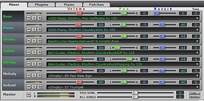
I'm liking the new mixer in BIAB 2014 but my eye is a bit overwhelmed with the array of faders. I think it might be better to add color to each sections of faders, VOLUME, PAN, REVERB such as illustrated here:  I'm not at all tied to these colors or even this concept but I think something like this would help the eye navigate the vast number of faders, buttons, etc. in the new 2014 mixer. John
|
|
|
|
|
|
|
|
|
|
|
|
Ask sales and support questions about Band-in-a-Box using natural language.
ChatPG's knowledge base includes the full Band-in-a-Box User Manual and sales information from the website.
|
|
|
|
|
|
|
|
|
|
|
User Video: Next-Level AI Music Editing with ACE Studio and Band-in-a-Box®
Band-in-a-Box® 2024 German for Windows is Here!
Band-in-a-Box® 2024 für Windows Deutsch ist verfügbar!
Wir waren fleißig und haben über 50 neue Funktionen und eine erstaunliche Sammlung neuer Inhalte hinzugefügt, darunter 222 RealTracks, neue RealStyles, MIDI SuperTracks, Instrumental Studies, "Songs with Vocals" Artist Performance Sets, abspielbare RealTracks Set 3, abspielbare RealDrums Set 2, zwei neue Sets von "RealDrums Stems", XPro Styles PAK 6, Xtra Styles PAK 17 und mehr!
Paket | Was ist Neu
Update Your PowerTracks Pro Audio 2024 Today!
The Newest RealBand 2024 Update is Here!
The newest RealBand 2024 Build 5 update is now available!
Download and install this to your RealBand 2024 for updated print options, streamlined loading and saving of .SGU & MGU (BB) files, and to add a number of program adjustments that address user-reported bugs and concerns.
This free update is available to all RealBand 2024 users. To learn more about this update and download it, head to www.pgmusic.com/support.realband.htm#20245
The Band-in-a-Box® Flash Drive Backup Option
Today (April 5) is National Flash Drive Day!
Did you know... not only can you download your Band-in-a-Box® Pro, MegaPAK, or PlusPAK purchase - you can also choose to add a flash drive backup copy with the installation files for only $15? It even comes with a Band-in-a-Box® keychain!
For the larger Band-in-a-Box® packages (UltraPAK, UltraPAK+, Audiophile Edition), the hard drive backup copy is available for only $25. This will include a preinstalled and ready to use program, along with your installation files.
Backup copies are offered during the checkout process on our website.
Already purchased your e-delivery version, and now you wish you had a backup copy? It's not too late! If your purchase was for the current version of Band-in-a-Box®, you can still reach out to our team directly to place your backup copy order!
Note: the Band-in-a-Box® keychain is only included with flash drive backup copies, and cannot be purchased separately.
Handy flash drive tip: Always try plugging in a USB device the wrong way first? If your flash drive (or other USB plug) doesn't have a symbol to indicate which way is up, look for the side with a seam on the metal connector (it only has a line across one side) - that's the side that either faces down or to the left, depending on your port placement.
Update your Band-in-a-Box® 2024 for Windows® Today!
Update your Band-in-a-Box® 2024 for Windows for free with build 1111!
With this update, there's more control when saving images from the Print Preview window, we've added defaults to the MultiPicker for sorting and font size, updated printing options, updated RealTracks and other content, and addressed user-reported issues with the StylePicker, MIDI Soloists, key signature changes, and more!
Learn more about this free update for Band-in-a-Box® 2024 for Windows at www.pgmusic.com/support_windowsupdates.htm#1111
Band-in-a-Box® 2024 Review: 4.75 out of 5 Stars!
If you're looking for a in-depth review of the newest Band-in-a-Box® 2024 for Windows version, you'll definitely find it with Sound-Guy's latest review, Band-in-a-Box® 2024 for Windows Review: Incredible new capabilities to experiment, compose, arrange and mix songs.
A few excerpts:
"The Tracks view is possibly the single most powerful addition in 2024 and opens up a new way to edit and generate accompaniments. Combined with the new MultiPicker Library Window, it makes BIAB nearly perfect as an 'intelligent' composer/arranger program."
"MIDI SuperTracks partial generation showing six variations – each time the section is generated it can be instantly auditioned, re-generated or backed out to a previous generation – and you can do this with any track type. This is MAJOR! This takes musical experimentation and honing an arrangement to a new level, and faster than ever."
"Band in a Box continues to be an expansive musical tool-set for both novice and experienced musicians to experiment, compose, arrange and mix songs, as well as an extensive educational resource. It is huge, with hundreds of functions, more than any one person is likely to ever use. Yet, so is any DAW that I have used. BIAB can do some things that no DAW does, and this year BIAB has more DAW-like functions than ever."
|
|
|
|
|
|
|
|
|
|
|
|
Forums66
Topics81,651
Posts735,444
Members38,526
| |
Most Online2,537
Jan 19th, 2020
|
|
|
|
|
|
|
|
|